 After teaching Thumper the different character shape, I gave her our first writing lesson about 2 days later. I’m definitely on a high because the results were really surprising to me, in a good way.
I only had formal Chinese instructions up to 4th grade, and as an adult, I find my writing pretty atrocious. It just looks like half way between a child’s and adult writing. It’s missing a lot of the components that make writing characters more akin to writing beautiful handwriting or beautiful calligraphy.
Background Info
As I talked about in the previous post about character shapes, there are a gazillion of them. Yes, I exaggerate a bit. Before our lesson I’ve actually done some random reading while researching stroke order and read about WHY we write Chinese character a particular way. It’s all about Chinese calligraphy, because calligraphy is an art. So good pretty writing is about making it look beautiful.
Unfortunately, with the advent of typesetting, many teachers lament that this skill is getting lost. The typesetting character isn’t necessarily how you would write a character. So it is very important to use 標楷體 when you’re using fonts for lesson plans. Because they tell you how the brush starts and stops. And if you know about strokes then when you see a character, you can look at it for clues on how to actually write the character.
I did not use to like this font because I did find that often they are not how we actually write characters though. But now I do use it knowing it’s mimicking brush strokes. However, I don’t think it is good as a way to copy how characters are written. This is why the character practice sheets from the major textbook publishing companies now have a 鋼筆字 component. One big reason is that the left right stroke (橫) is actually written at a 7 degree angle. Don’t ask me why it’s exactly 7 degrees. But I read about it on this website. I actually then went and drew a character grid and mapped my 標楷體 onto it. And it is indeed 7 degrees for all the 標楷體 characters.
I’ve been searching and searching online over 3 years for a font that mimics 鋼筆字 and really none are exactly right for young children, because they do add a beautiful writing component to it and this means that the strokes are sometimes not very clear, they kind of start mimicking brushes. However, I’m now using the 華康雅風體 in my dictionary since it’s going to be used for writing. You can find bootlegged copies online all over the place.
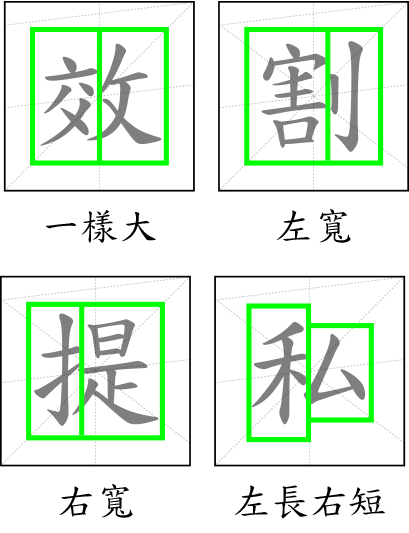
Because writing Chinese characters is all about fitting into a square. So another thing I learned about strokes is that sometimes strokes change in order for the character to fit properly into one square. For example, for the character 林, which is made up of two 木’s. 木’s stroke order is 一橫,一豎,一瞥,一捺. When it’s written on the left side, it’s 一橫,一豎,一瞥,一點. So the left to right diagonal () is shortened in order to allow room for the right 木 to fit in there. There are many cases like that.
Apparently if you look at the character practice sheets from New Taipei Government, you can kind of see this. When they teach characters, they do point out these little gotchas. I really really wanted to use these character practice sheets. But alas, we’re following Sagebook, so instead I’m making more work for me by doing it myself through using the 華康雅風體 font.
How I presented
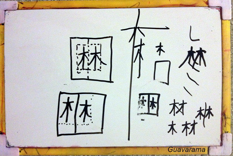 Tonight, we started our lesson with the character 林. First we looked at the character structure reference I made for Thumper and we talked about its character structure. Then we talked about the character shapes of the character and decided that they were two same long rectangles. I then gave Thumper a few example of what long rectangles mean. The left/right stroke is proportional to the diagonal strokes, this is how you can make that rectangle. It isn’t too long nor too short. I also talked about how the point of writing character is it’s in the center of the square. It isn’t hiding on the top left corner or bottom right corner. Finally I talked about how when we actually write Chinese, the left to right stroke goes slightly up. (I read about the 7 degrees only after the presentation).
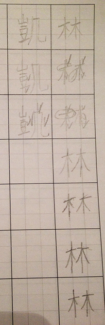
After practicing different ways to NOT write 林, I finally got down to work showing her how to write it. I wrote it on the character practice booklet I made 6 months ago for her. (Finally!) And wow, if I may say so myself, my writing actually is not bad looking for once. These workbooks have 7 characters total in one column only, with the top to be written by the teacher. From the character component paper and other things I’ve read, they say that practicing and practicing and practicing writing is not going to make the child actually remember how to write it. This is one reason why I’m limiting it only to 6 characters. I’m hoping that with other writing practice it’ll stick better. However, I do see how beautiful writing characters is both a muscle memory and mindful writing thing so I need to figure out what to do about that.

Anyways, borrowing an idea from the English handwriting workbook I purchased, I asked Thumper to write two characters in her book, make little circles in the character of where she thinks she needs improvement and where she’s writing well. Then she tries again with the next two, and finally with the last two she writes them w/ no critique for me to see.
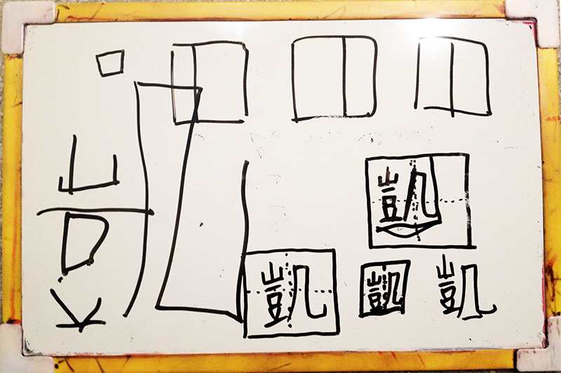
Since the practice sheet does have a crosshair in it to guide you, it helped her see where to start the writing when she’s copying my character. Her character writing turned out very well for 林. She wanted to try it with 凱, but we had a tough time deciding what type of character shape & structure it has. We analyzed it to death. It did turn out pretty good too compared with before. And definitely I’m amazed at how much better I write. But I can see she does just need more practice writing in general because she can’t quite make her lines too straight or her curves curvy enough yet.
I’m not sure how long we can make this interest in writing beautify characters last. I will have to figure out how to make it more interesting as we go along.
Addendums
In regards to writing in general, I’m glad we’re finally starting at age 7.5. It is a bit old and it isn’t like she was not writing before now. But for 3 years I was super frustrated that she was holding her pencil incorrectly but her school work makes her write. It’s mostly her choice to write of course but we weren’t going to a play-based school. Finally this year she’s got enough strength in her hand to hold her pencil right. And I can see how an older age makes a bigger difference in how well she can manipulate that pencil. She was just one of those kids who did not develop her pincer grip early enough.
Lastly, after reading that article about 7 degrees, I’m going to be changing all of our practice sheets to that format instead. I am a lazy person and I don’t like to nag. I hate for her to develop the habit of writing a specific way, having her muscles remember it, and then having to correct it when she gets older. It seems just so much easier that the guides for writing slanted is IN the practice sheets.
I’m going to be making my reference guide for these character shapes next.


How do you create your character practice sheets?